Session Charts
Charts unique to each individual session can be displayed by double clicking any session in the tree or right click and choose View Charts.
Summary
Important
NEW in 2.0 show time in zone for speed, power, cadence, and heart rate
NEW in 2.0 show critical power metrics and balance metrics on session summary
NEW in 2.0 added heart rate to session bests table
NEW in 2.1 added fitness, fatigue, and form graphical representation
NEW in 2.1 show segment PR’s in overview map
NEW in 2.1.1 renamed Stress to Load
NEW in 2.1.1 average and maximum VAM show in tooltip for average and maximum speed
NEW in 2.2 show summary of power using a polarized model.
NEW in 2.2 include 30 minutes in bests table.
NEW in 2.2 show trend information for balance metrics.
NEW in 2.4 expanded intervals shown for session bests
NEW in 2.4 show highlighting for bests in table and on metric maximums
NEW in 2.4 add indicator for empty tank effort on critical power metrics
NEW in 2.6 added support for running sessions
NEW in 2.6 redesigned summary tiles and time in zone line graphs
Cycling
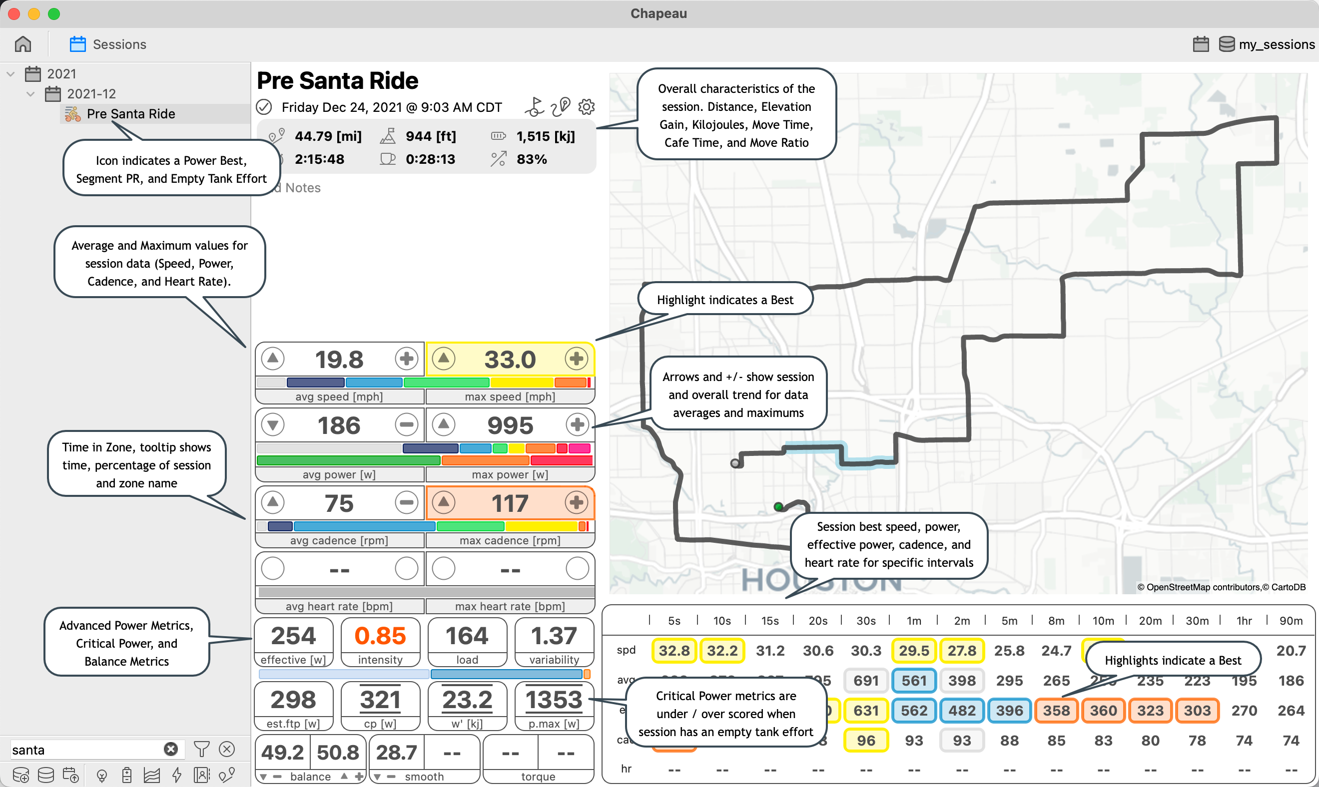
The Session Summary panel shows top level information about the session including how much time was spent riding, how much time was spent stopped, elevation gain, trends for metrics, and bests for speed, power, effective power, cadence, and heart rate at a variety of intervals.
Running
Important
NEW in 2.6.1 Include Running Effectiveness.
NEW in 2.6.1 Show Form Power Ratio distribution.
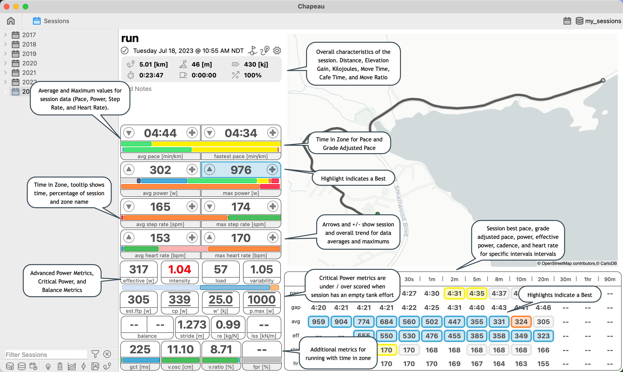
The Session Summary panel shows top level information about the session including how much time was spent running, how much time was spent stopped, elevation gain, trends for metrics, and bests for pace, grade adjusted pace, power, effective power, step rate, and heart rate at a variety of intervals.
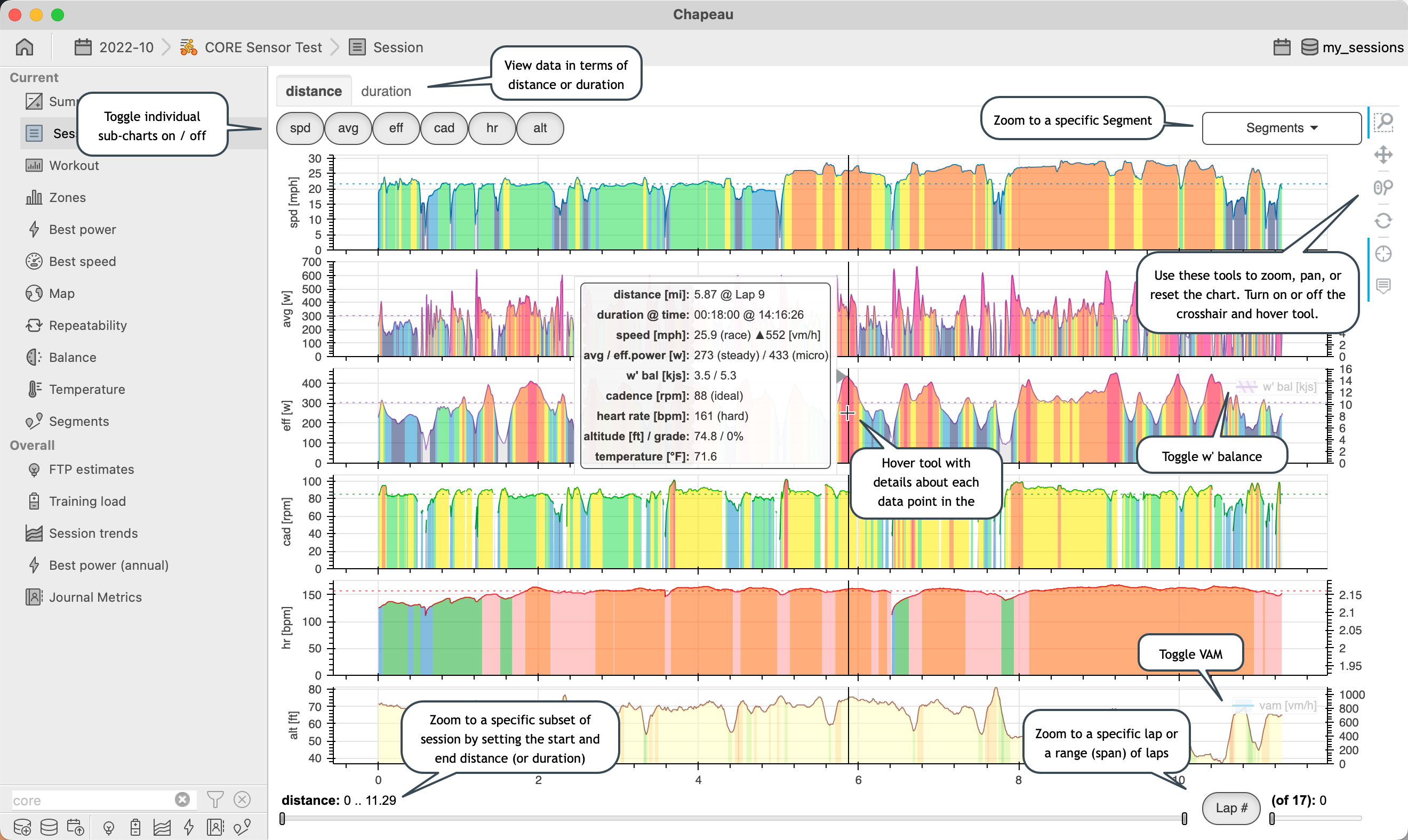
Session
Important
NEW in 2.0 show w’ balance on power charts
NEW in 2.0 show time and distance for currently displayed section
NEW in 2.0 use abbreviated names on toggle buttons and chart y-axes
NEW in 2.0 remove redundant x-axes labels
NEW in 2.1 add segment zoom control
NEW in 2.1 added VAM to altitude chart, show VAM values with speed summary
NEW in 2.1 show elevation gain and average gradient for altitude summary
NEW in 2.2 show aerobic efficiency and calculate aerobic (de)coupling
NEW in 2.4 show w’ balance based on Empty Tank Effort Critical Power
NEW in 2.4 show Empty Tank Efforts on w’ balance
NEW in 2.4.2 renamed Ride to Session
NEW in 2.6 added support for running sessions
Cycling
The session chart presents data collected / created on the bike versus distance and versus duration. Zooming shows summary statistics and activates Aerobic Efficiency on the heart rate plot.
Note
Speed: on fast sessions values less then 3 m/s (6.71 mph or 10.8 kph) are excluded from the summary (slow sessions threshold is 1 mph)
Cadence: values less than 20 RPM are excluded from the summary
Heart Rate: values less than 10 BPM are included from the summary
Note
Effective Power is used to determine training load.
Effective Power is used to determine intensity.
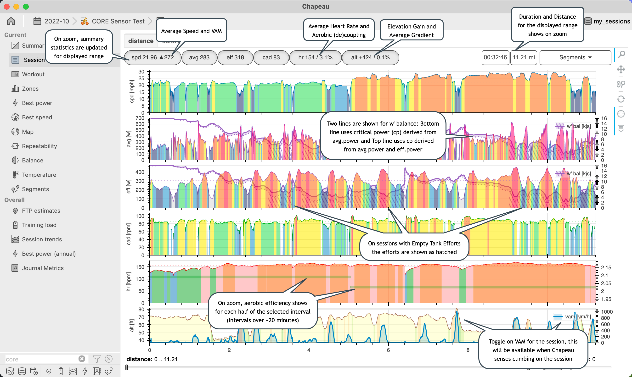
Note
VAM included on altitude plot if max VAM > 300 m/hr
Aerobic Decoupling is available when heart rate and power present in session and zoomed to a portion of the sessions which is more than 20 minutes
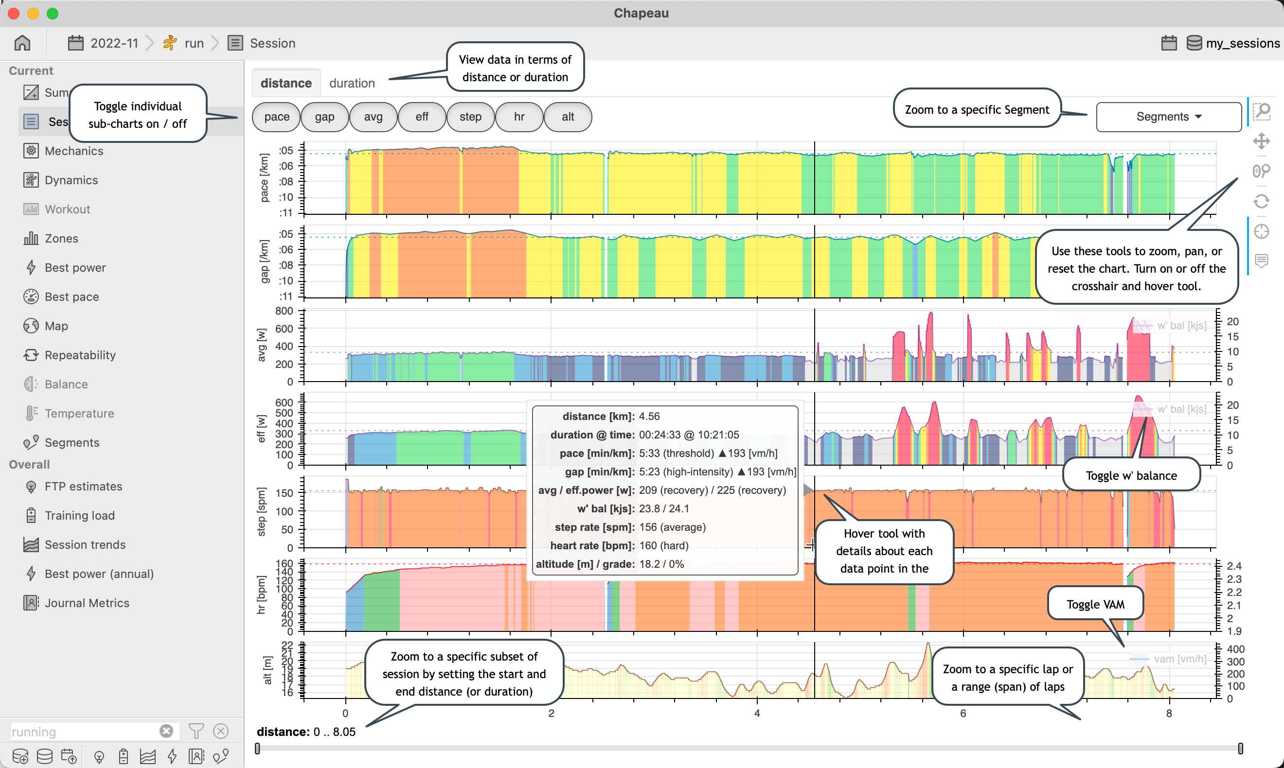
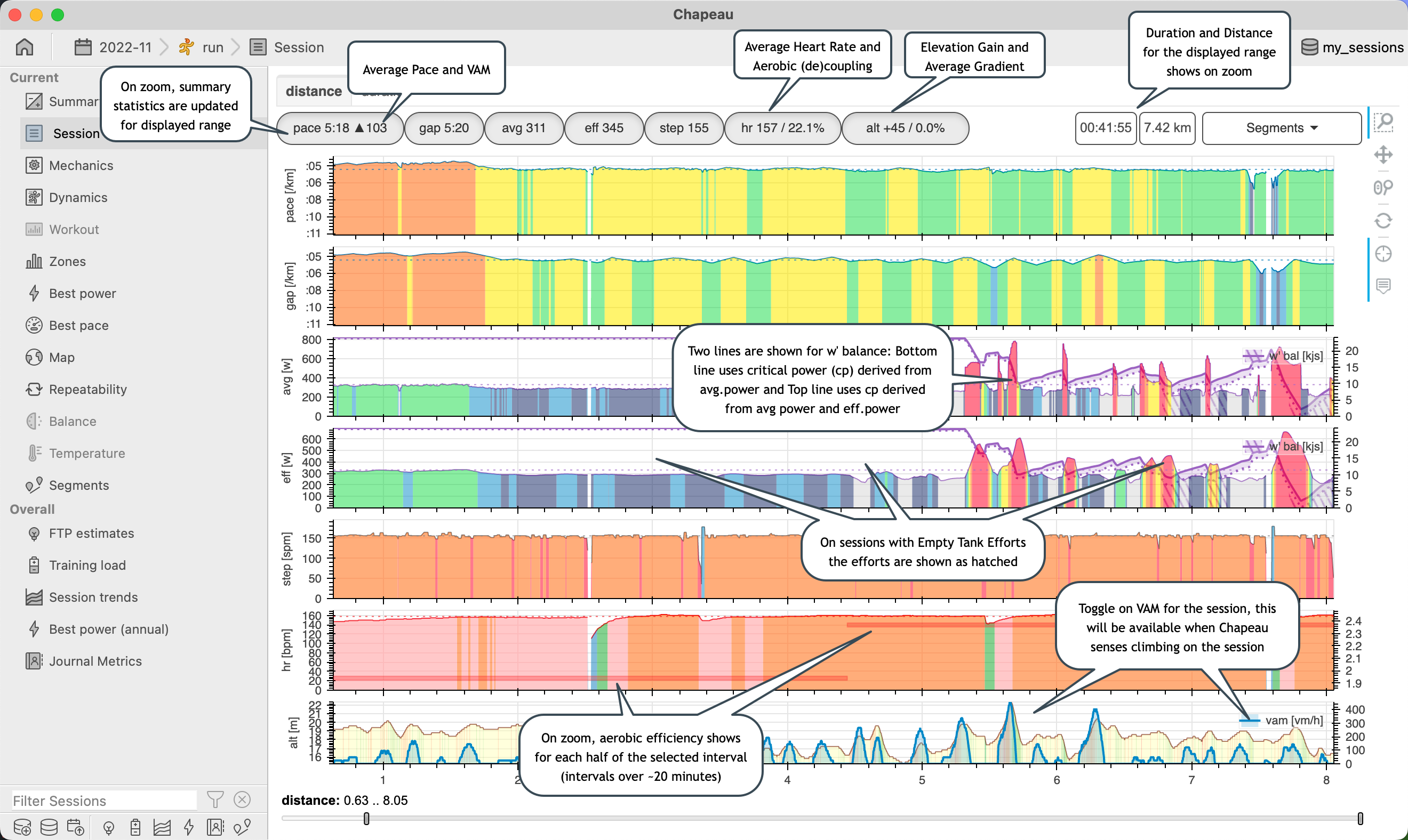
Running
The session chart presents data collected during a run versus distance and versus duration. Zooming shows summary statistics and activates Aerobic Efficiency on the heart rate plot.
Note
Step Rate: values less than 20 SPM are excluded from the summary
Heart Rate: values less than 10 BPM are included from the summary
Note
Effective Power is a weighted moving average representation of power.
Effective Power is used to determine intensity.
Note
It is possible for W’ Balance to become negative. From a modelling perspective this happens:
the session had an exceptional effort (or efforts) above / well above term:critical power<Critical Power> for an extended period of time
an underestimation of Anaerobic Work Capacity or
general algorithmic issues when calculating W’ Balance (the science for decline is evolving and varied)
other …
From a physiology standpoint the most likely cause of negative W’ Balance is due to an exceptional effort where the athlete emptied the tank. In v2.4 on sessions with empty tank efforts a session specific term:critical power<Critical Power> is calculated (if possible) and then W’ Balance is calculated using the session specific term:critical power<Critical Power>. This approach is taken since there is more likelihood in an exceptional effort occurring on a session than Anaerobic Work Capacity increasing suddenly.
The region for which W’ Balance would have been negative (if a session specific term:critical power<Critical Power> was not calculated) is shown on the Session Chart as a hatch under the lower W’ Balance line. In general these hatches are where the athlete pushed hard.
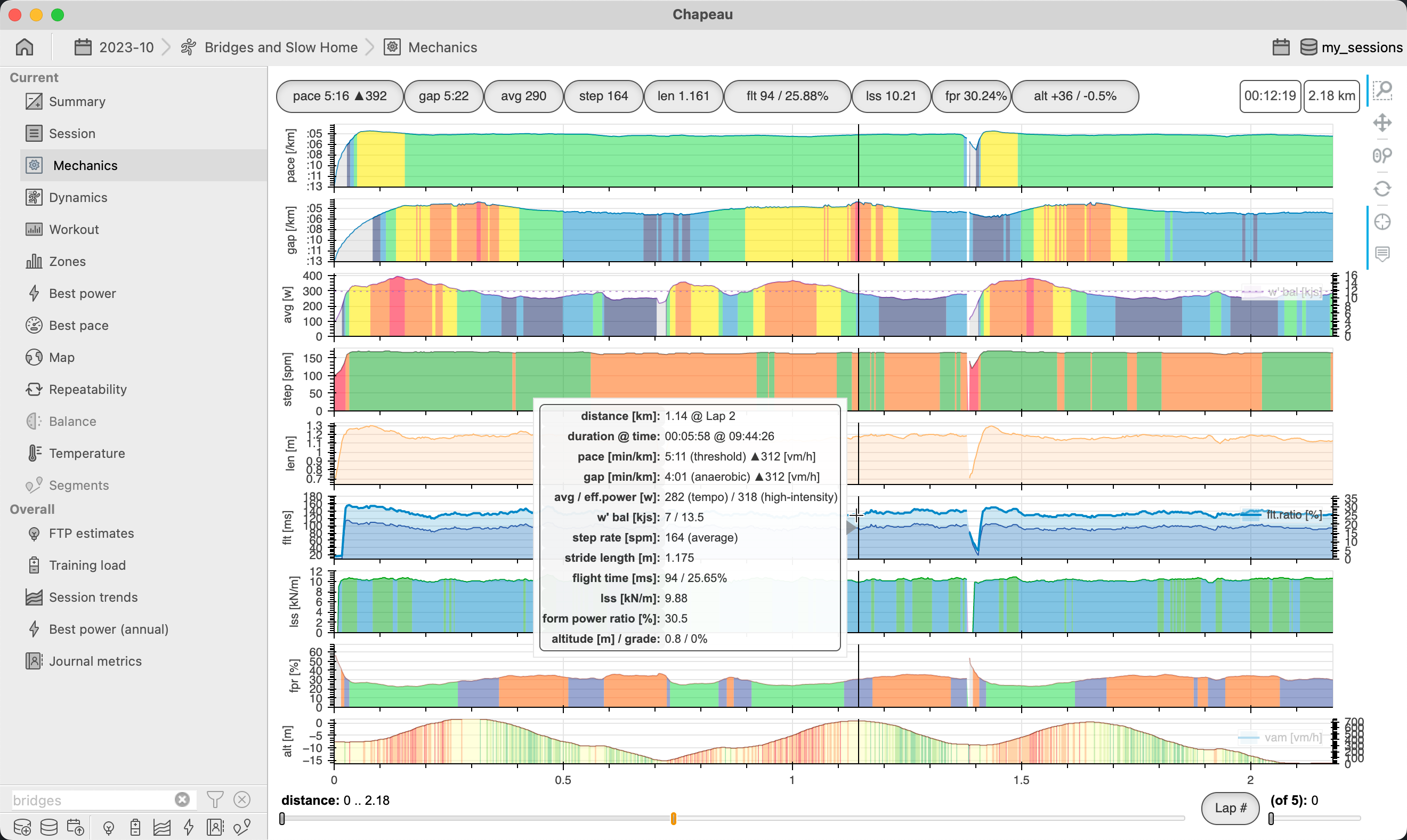
Mechanics (running)
Important
NEW in 2.6
NEW in 2.6.1 added Flight Time Ratio
The mechanics chart shows biomechanical related data, in particular the chart will include (when available) stride length, flight time, flight time ratio, leg spring stiffness, and form power ratio. These are shown alongside pace, grade adjusted pace, average power, step rate, and altitude. The functionality is very similar to the Session Chart.
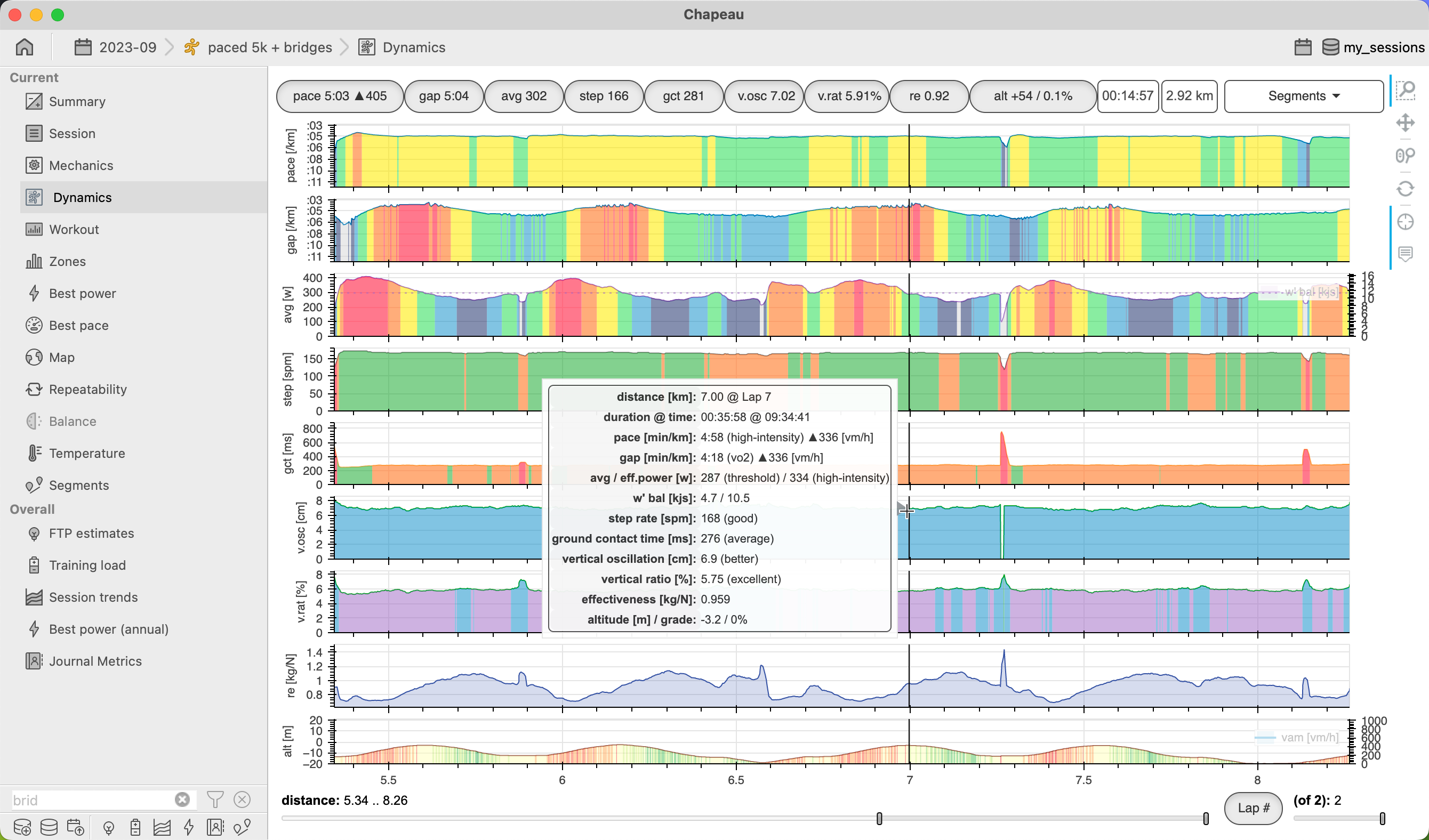
Dynamics (running)
Important
NEW in 2.6
The dynamics chart shows running dynamics related data, in particular the chart will include (when available) ground contact time, vertical oscillation, vertical ratio, and running effectiveness. These are shown alongside pace, grade adjusted pace, average power, step rate, and altitude. The functionality is very similar to the Session Chart.
Workout
Important
NEW in 2.3 increase table height and remove zone columns for cadence and speed.
NEW in 2.3 show VAM summary chart and include VAM in table.
NEW in 2.3.1 show a column of move time.
NEW in 2.6 added support for running sessions.
NEW in 2.6 show colors for zone, remove zone column from table, enhance tooltips.
The workout chart shows summary values for any laps / intervals recorded during your session. Some people may have this set up to be recorded for every mile of the session, others may manually indicate laps during the session. Alternatively, you can edit or create laps using the functionality of Chapeau.
Cycling
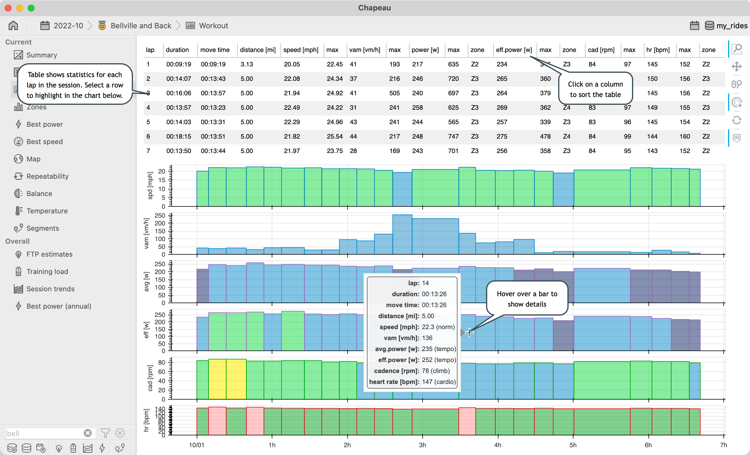
Note
Speed: on fast sessions values less then 3 m/s (6.71 mph or 10.8 kph) are excluded from the summary (slow sessions threshold is 1 mph)
Cadence: values less than 20 RPM are excluded from the summary
Heart Rate: values less than 10 BPM are included from the summary
Running
Important
NEW in 2.6.1 include Ground Contact Time, Vertical Oscillation, Vertical Ratio, Form Power Ratio, and Running Effectiveness in table.
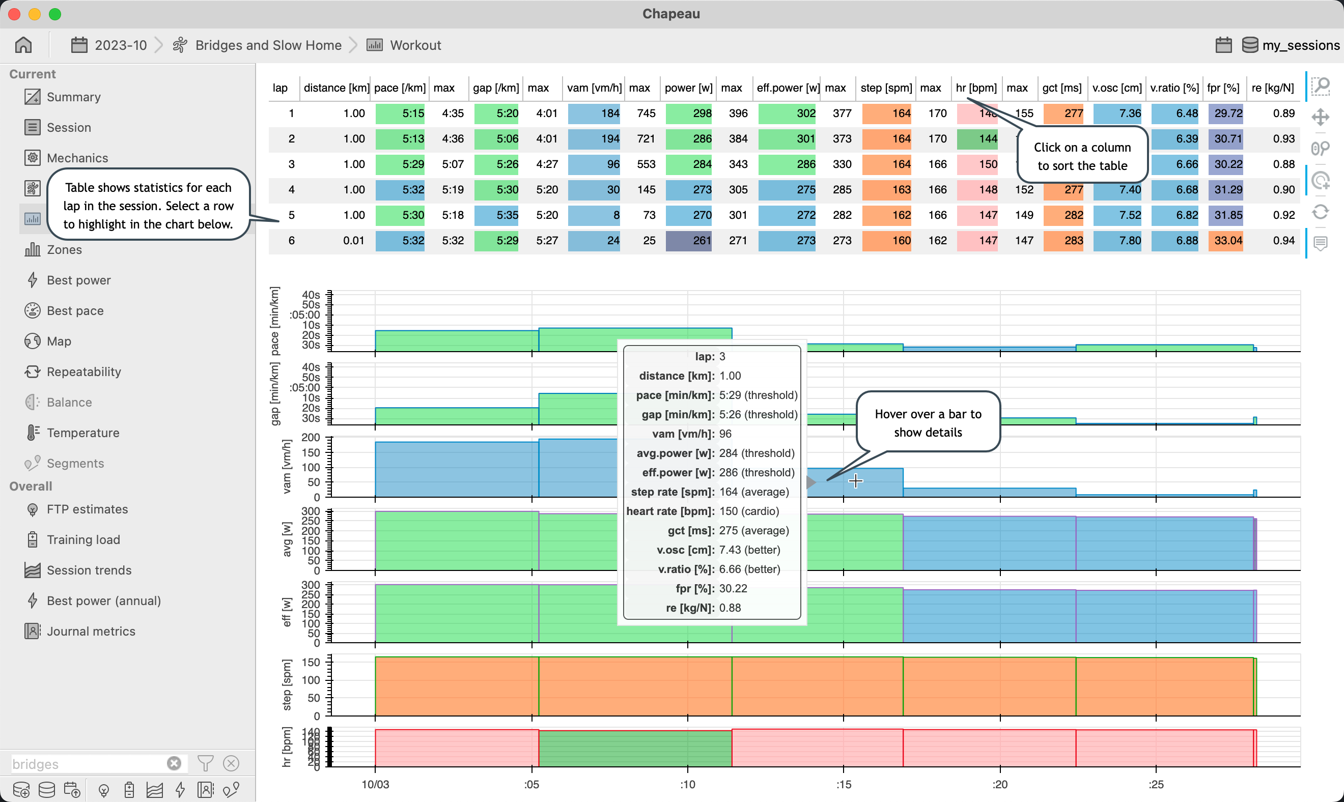
Note
Step Rate: values less than 20 SPM are excluded from the summary
Heart Rate: values less than 10 BPM are included from the summary
Zones
Important
NEW in 2.1.1 show FTP and Max Heart Rate indicators
NEW in 2.1.1 tooltip for zone column in table shows the zone boundaries
NEW in 2.3 show graph for core temperature when available for session
NEW in 2.6 added support for running sessions
NEW in 2.6 add zone colors into the table
Cycling
The Zones chart shows the distribution of time spent at a specific speed, average power, effective power, cadence, heart rate, and core temperature. Each chart is color-coded by zone. Refer to workout notes regarding summary.
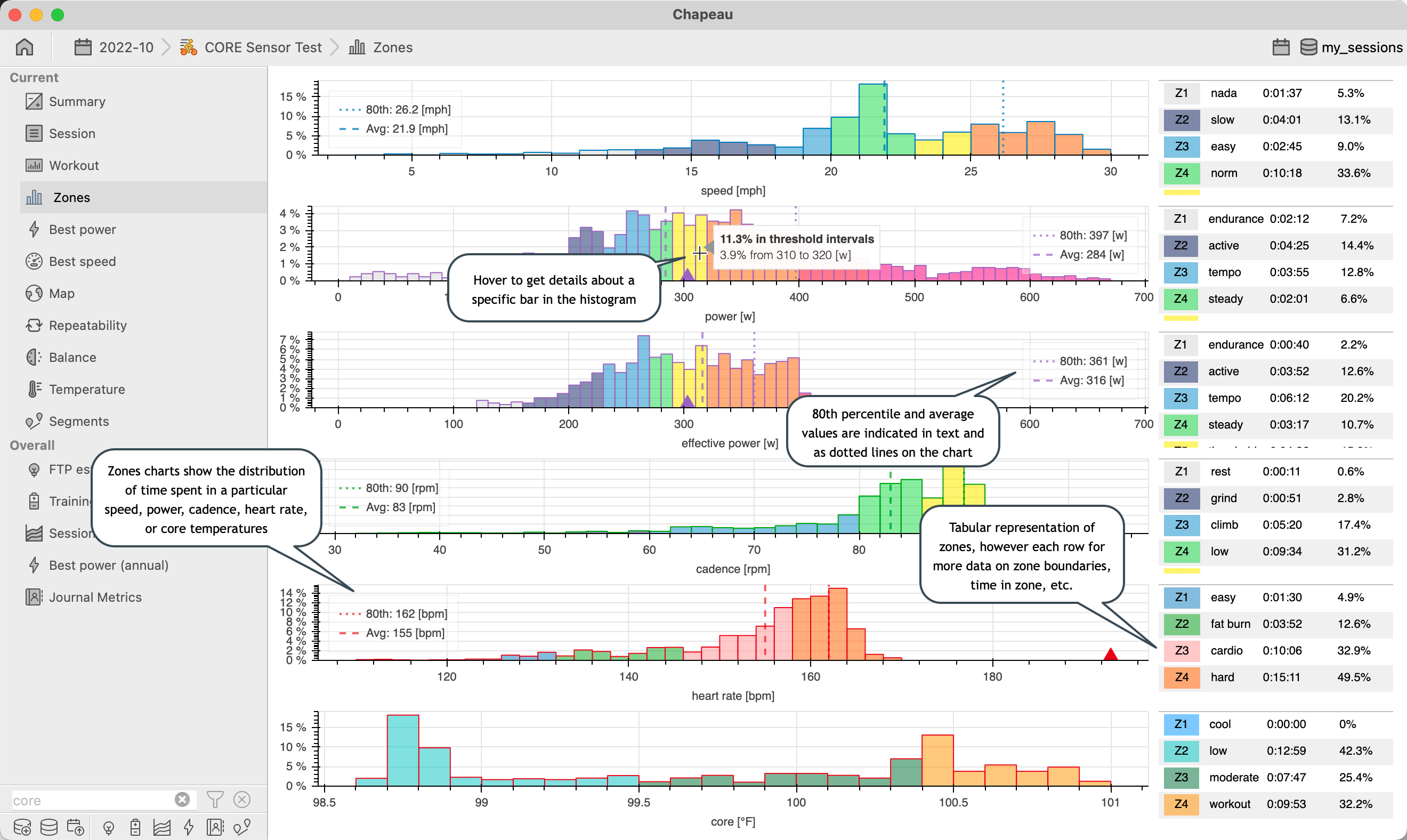
Note
A tabular representation of the zones can be found on the right-hand side giving at-a-glance numbers for each zone. Hovering over the time values in the tables will show the cumulative time above and below the zone (inclusive).
Running
The Zones chart shows the distribution of time spent at a specific pace, grade adjusted pace, average power, effective power, step rate, heart rate, and core temperature. Each chart is color-coded by zone. Refer to workout notes regarding summary.
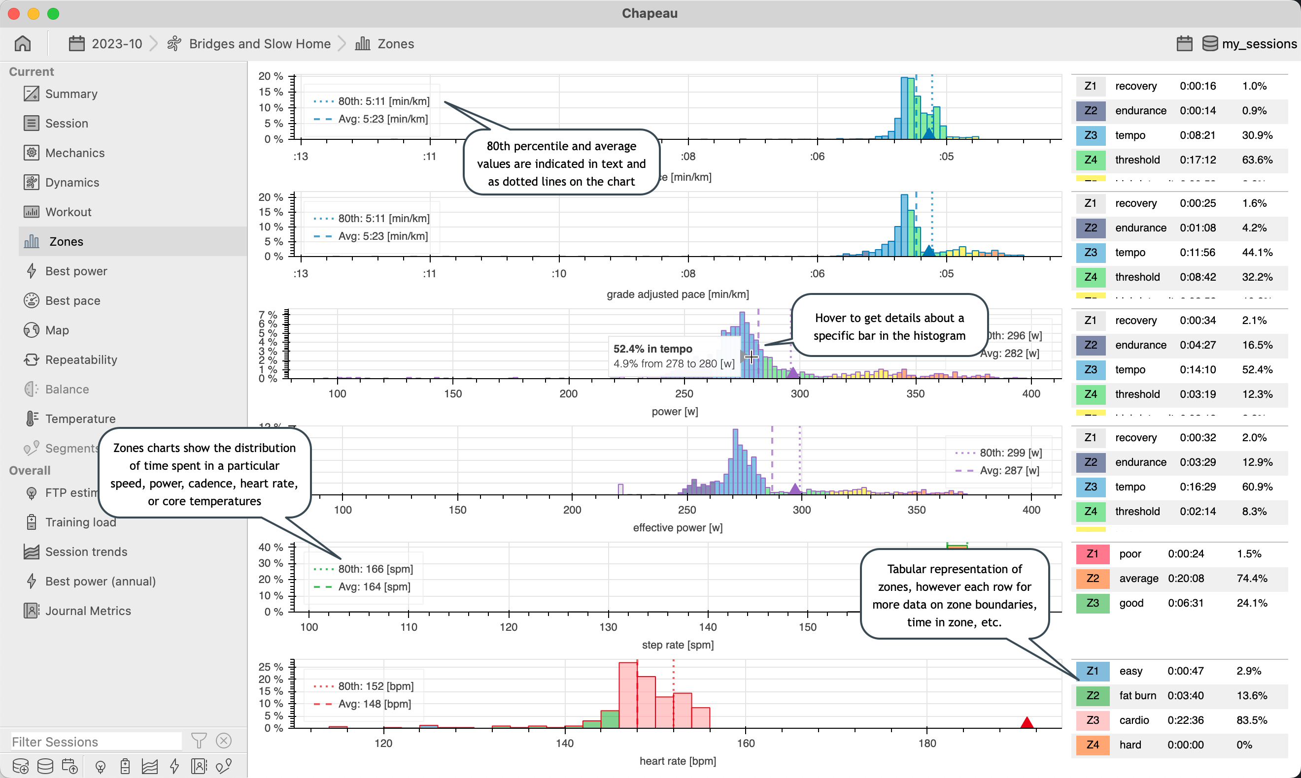
A tabular representation of the zones can be found on the right-hand side giving at-a-glance numbers for each zone. Hovering over the time values in the tables will show the cumulative time above and below the zone (inclusive).
Note
A tabular representation of the zones can be found on the right-hand side giving at-a-glance numbers for each zone. Hovering over the time values in the tables will show the cumulative time above and below the zone (inclusive).
Best Power
Important
NEW in 2.0 shows critical power based on average power and effective power
NEW in 2.1 simplified hover tool for hintervals chart
NEW in 2.3 allow power curves to be toggled on / off
NEW in 2.3 include Fatigue Resistance power curves
NEW in 2.4 show curve for Critical Power calculated on sessions with an Empty Tank Effort
NEW in 2.6 added support for running sessions
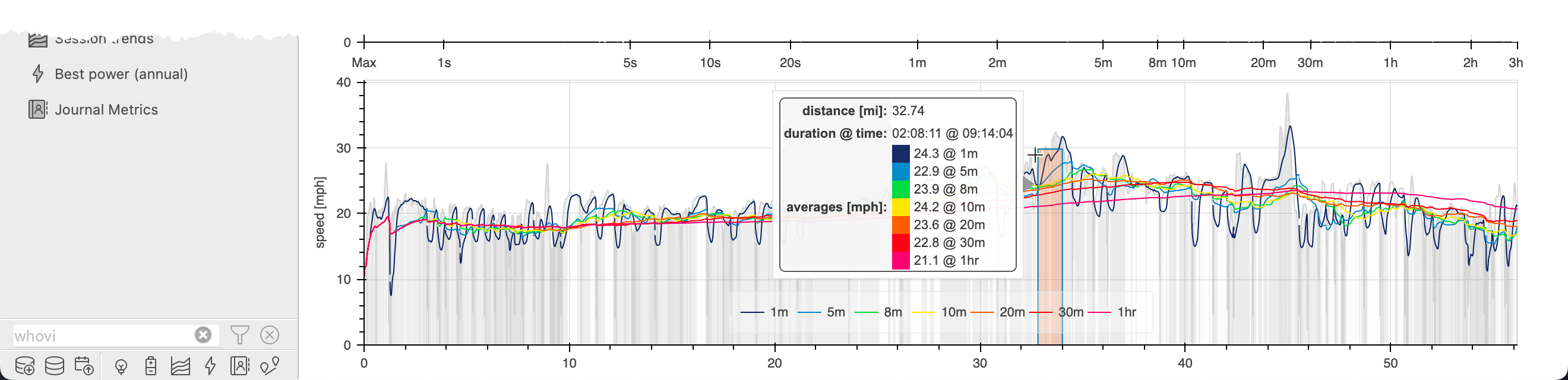
The Best Power chart shows the Power Curve associated with the current session overlaid on top of the 1st, 2nd, 3rd, and 4th best power curves to the date of the current session. When you hover over the upper Power Curve chart, a box appears showing the region (in time) where the interval occurred.
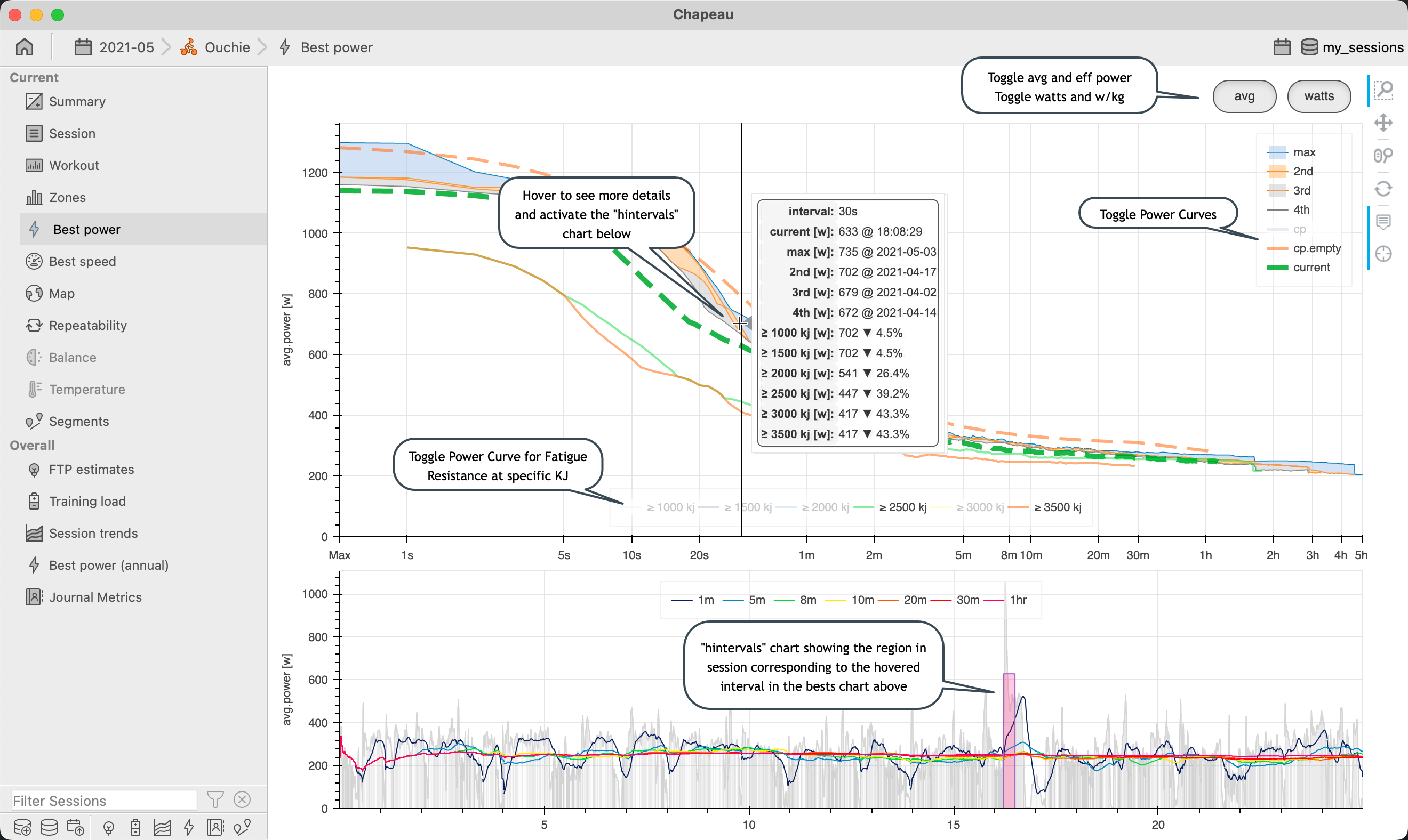
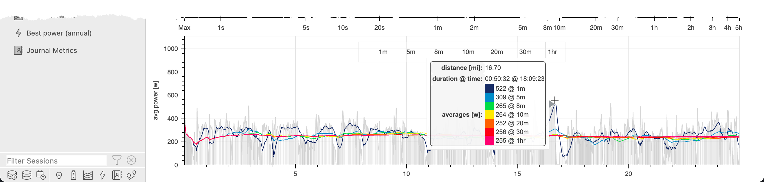
The chart below, which we call the hintervals chart, shows the moving average 1-, 5-, 8-, 10-, 20-, 30-minute, and 1 hour interval power as trend lines which is a great way to see how your power profile varied throughout your session.
Best Speed (cycling)
The Best Speed chart shows the Speed Curve associated with the current session overlaid on top of the 1st, 2nd, 3rd and 4th best power curves to the date of the current session. When you hover over the upper Speed Curve chart, a box appears showing the region (in time) when that best interval happened.
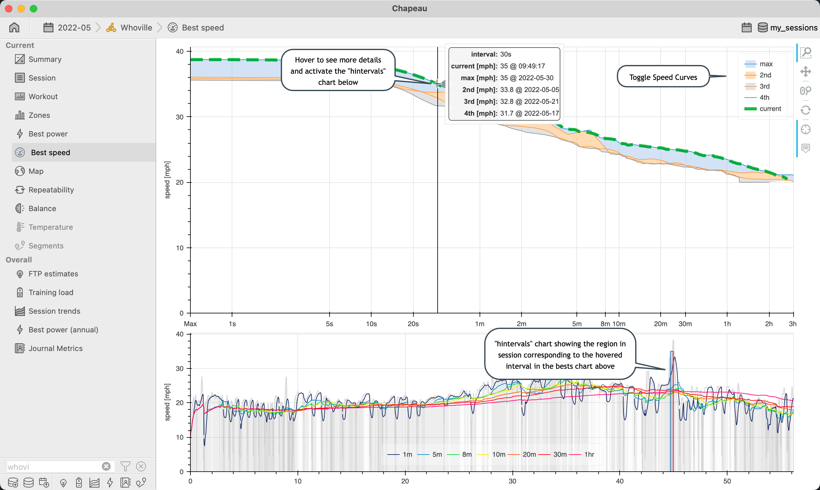
The chart below, which we call the hintervals chart, shows the moving average 1-, 5-, 8-, 10-, 20-, and 30-minute interval power as lines which is a great way to see how your speed profile varied throughout your session.
Best Pace (running)
Important
NEW in 2.6 added for use with running sessions
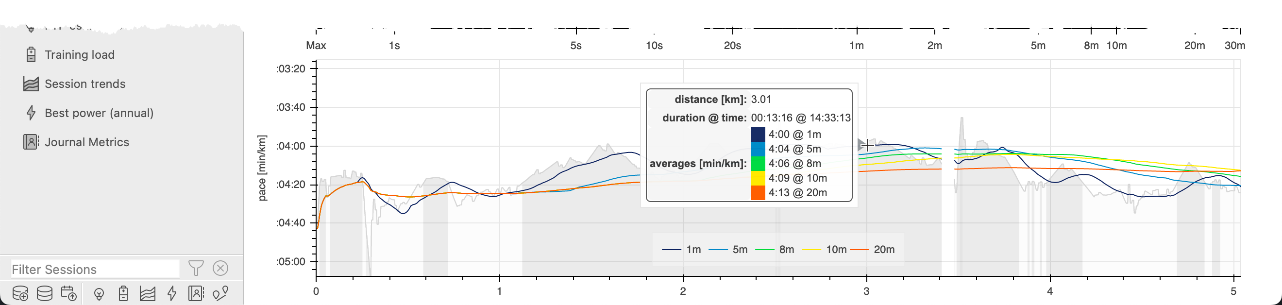
The Best Pace chart shows the Pace Curve associated with the current session overlaid on top of the 1st, 2nd, 3rd and 4th best power curves to the date of the current session. When you hover over the upper Pace Curve chart, a box appears showing the region (in time) when that best interval happened.
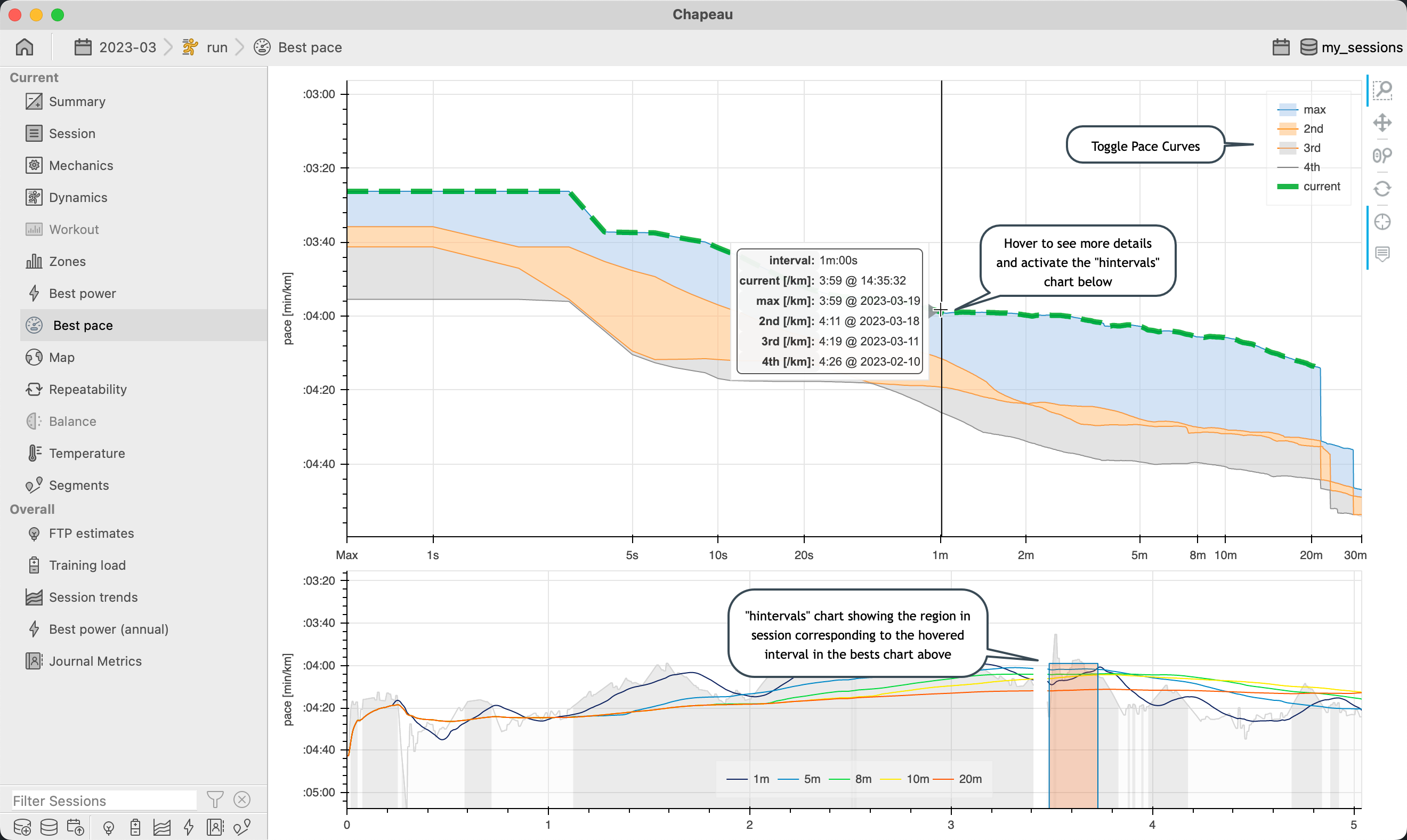
The chart below, which we call the hintervals chart, shows the moving average 1-, 5-, 8-, 10-, 20-, and 30-minute interval power as lines which is a great way to see how your pace profile varied throughout your session.
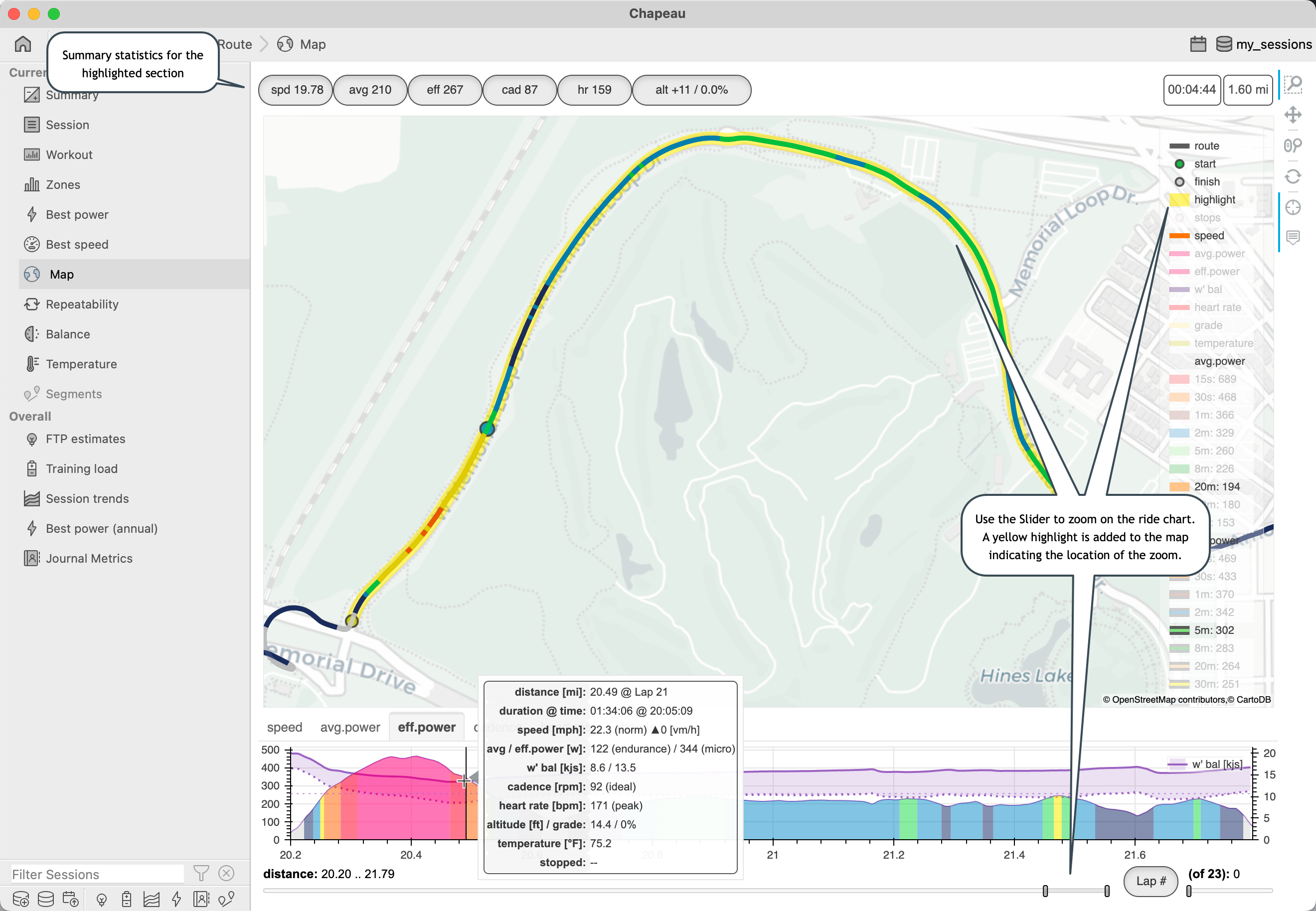
Map
Important
NEW in 2.0 shows w’ balance on power charts and as an overlay
NEW in 2.1 add summary capabilities
NEW in 2.1 add lap and segment zoom controls
NEW in 2.1 added VAM to altitude chart
NEW in 2.1 show segment PR’s as optional overlay
NEW in 2.1 stops is now a toggleable layer
NEW in 2.1 added 30 minute power best segment for avg.power and eff.power
NEW in 2.3 show aerobic efficiency and calculate aerobic (de)coupling
NEW in 2.3 show temperature and core temperature as overlays when data is available
NEW in 2.6 added support for running sessions
The map shows where you went during your session and is packed with useful information including information about where your best power intervals happened and where you stopped.
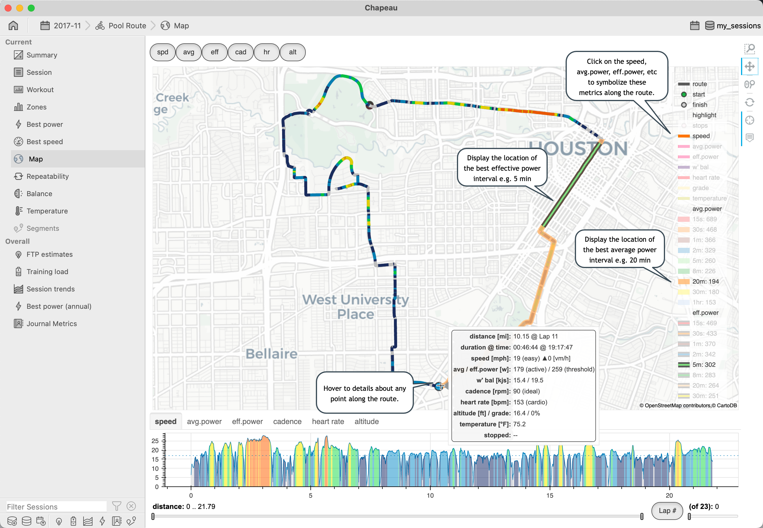
Box zooming on the lower chart will directly highlight the area and when you release the mouse both the map and the lower chart will automatically zoom the selected section of the session.
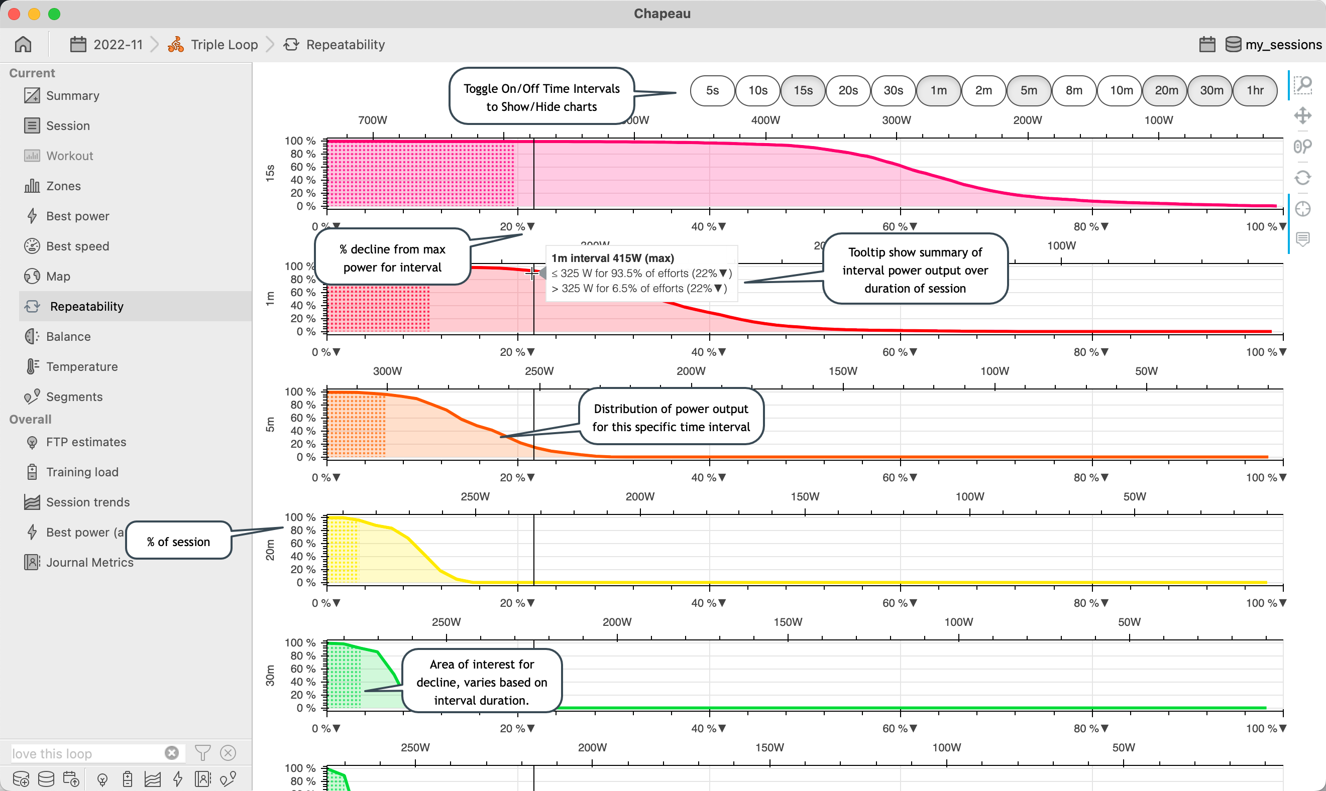
Repeatability
Important
NEW in 1.7.0
NEW in 2.6 added support for running sessions
The Repeatability chart shows the distribution of average power for common intervals. The graph is plotted as percentage power decline (from max power for the interval) vs the percentage of time spent at that power. A second x axis shows the absolute power (from max power to min power for the interval). This chart complements the Best power chart by giving insight into how well you were able to sustain power for a given interval.
Use this chart to gain insights into an inquiry like In this session I had 375W for 1-minute, but how many other good 1-minute efforts did I have?. From the example below it shows that while there was one 1-minute effort at 375W, 11% of all 1-minute efforts were greater than 300W.
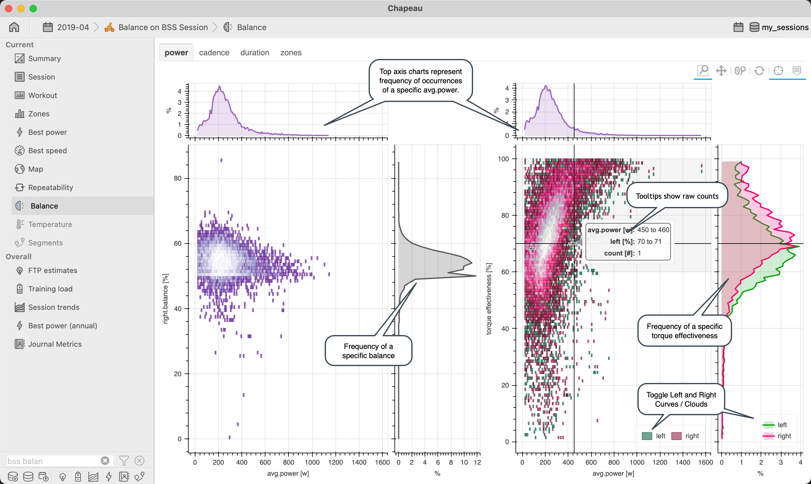
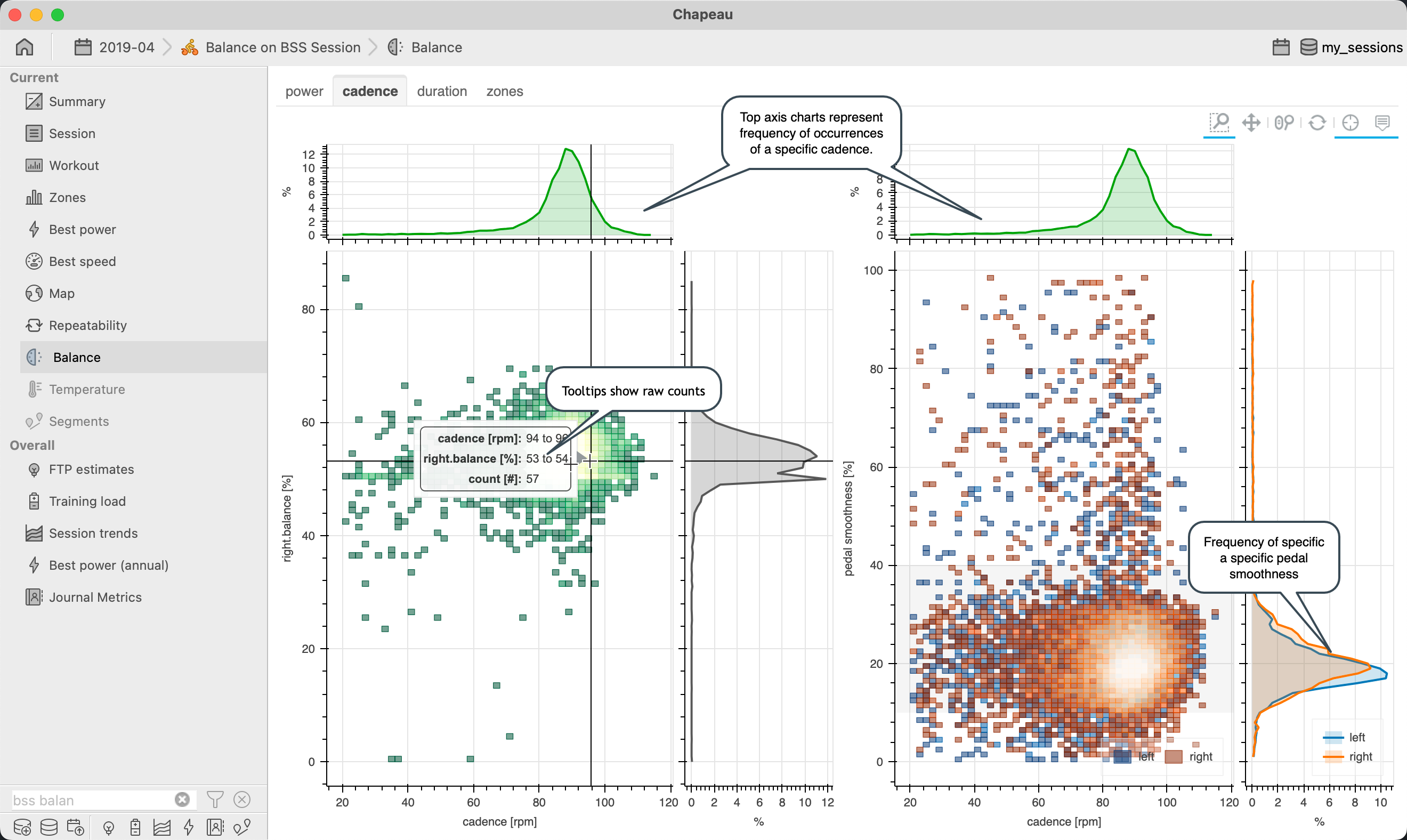
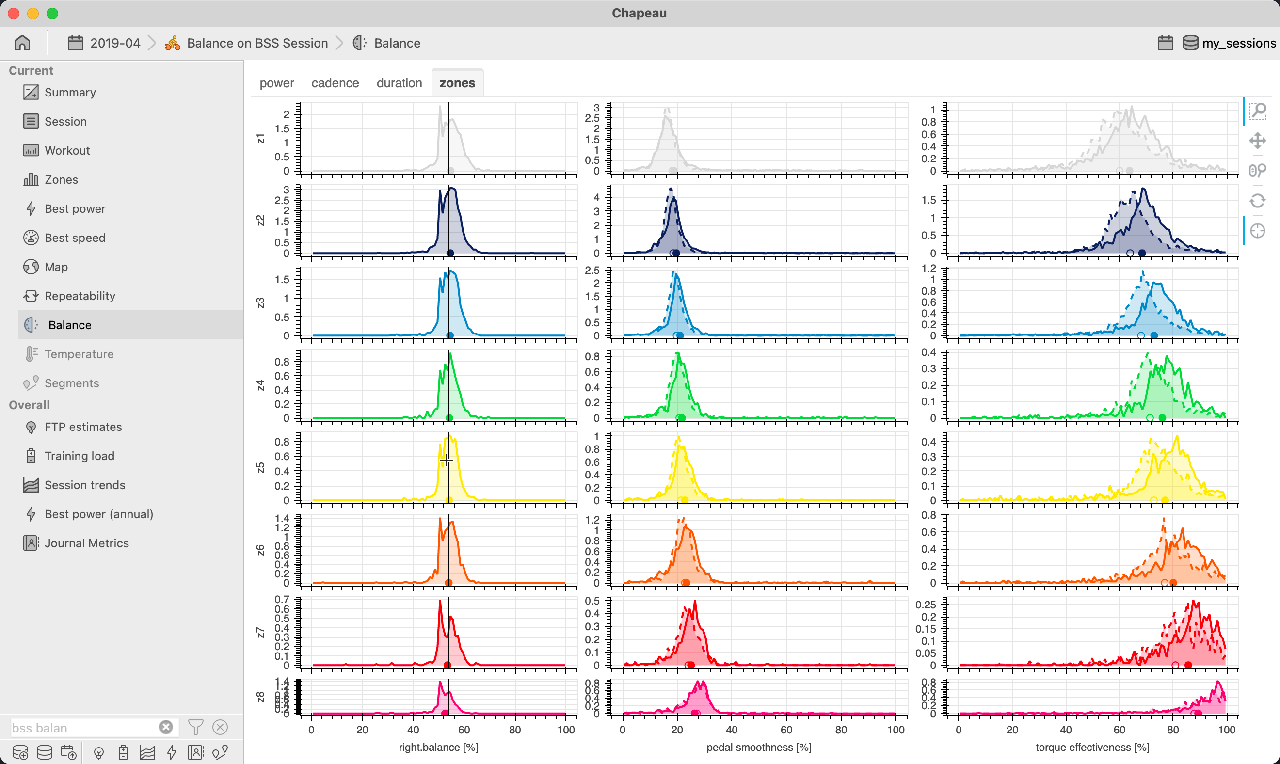
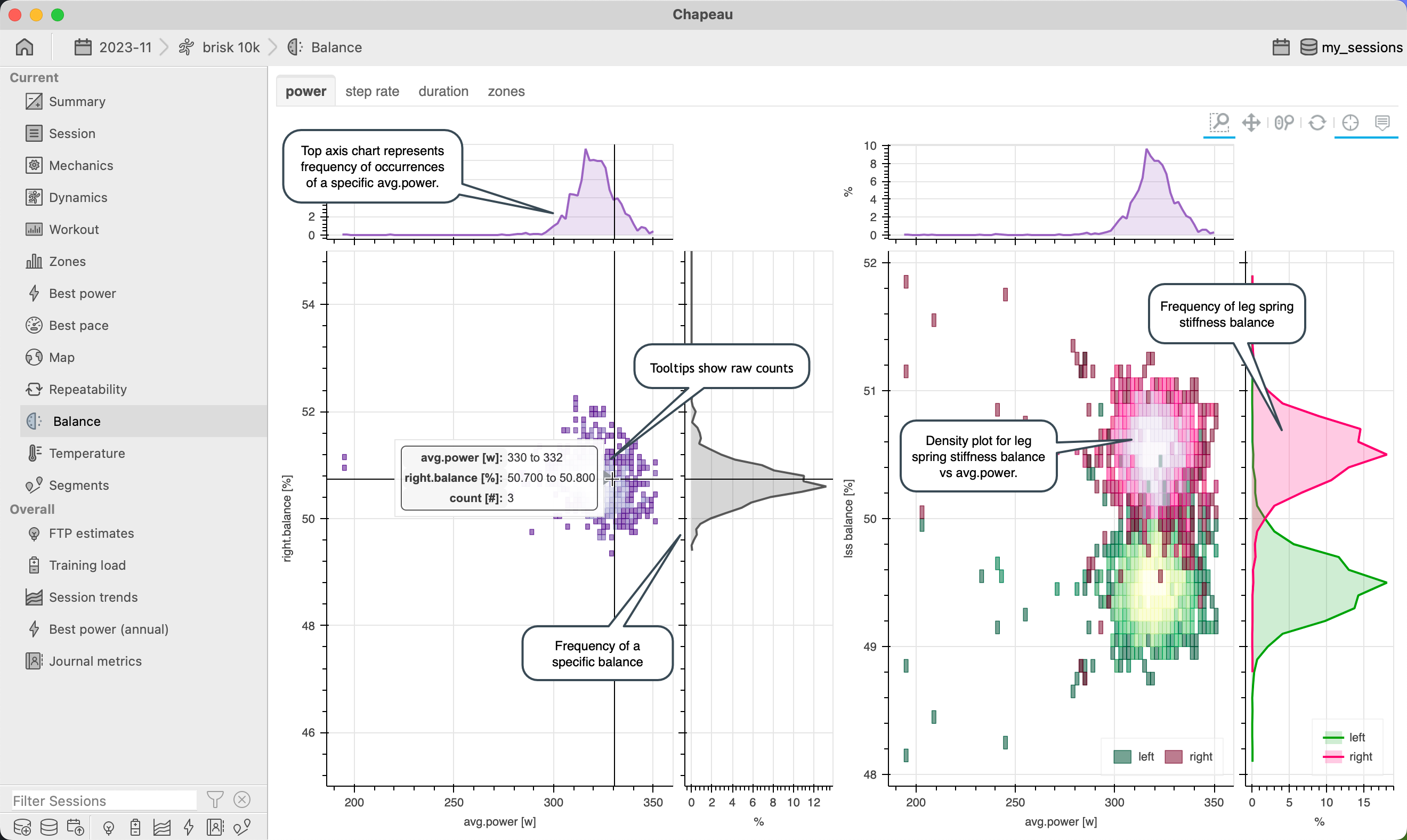
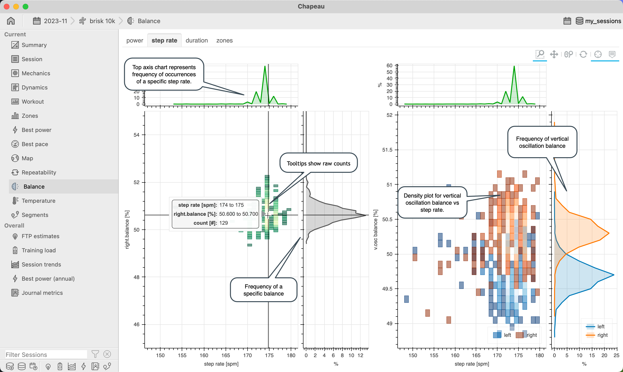
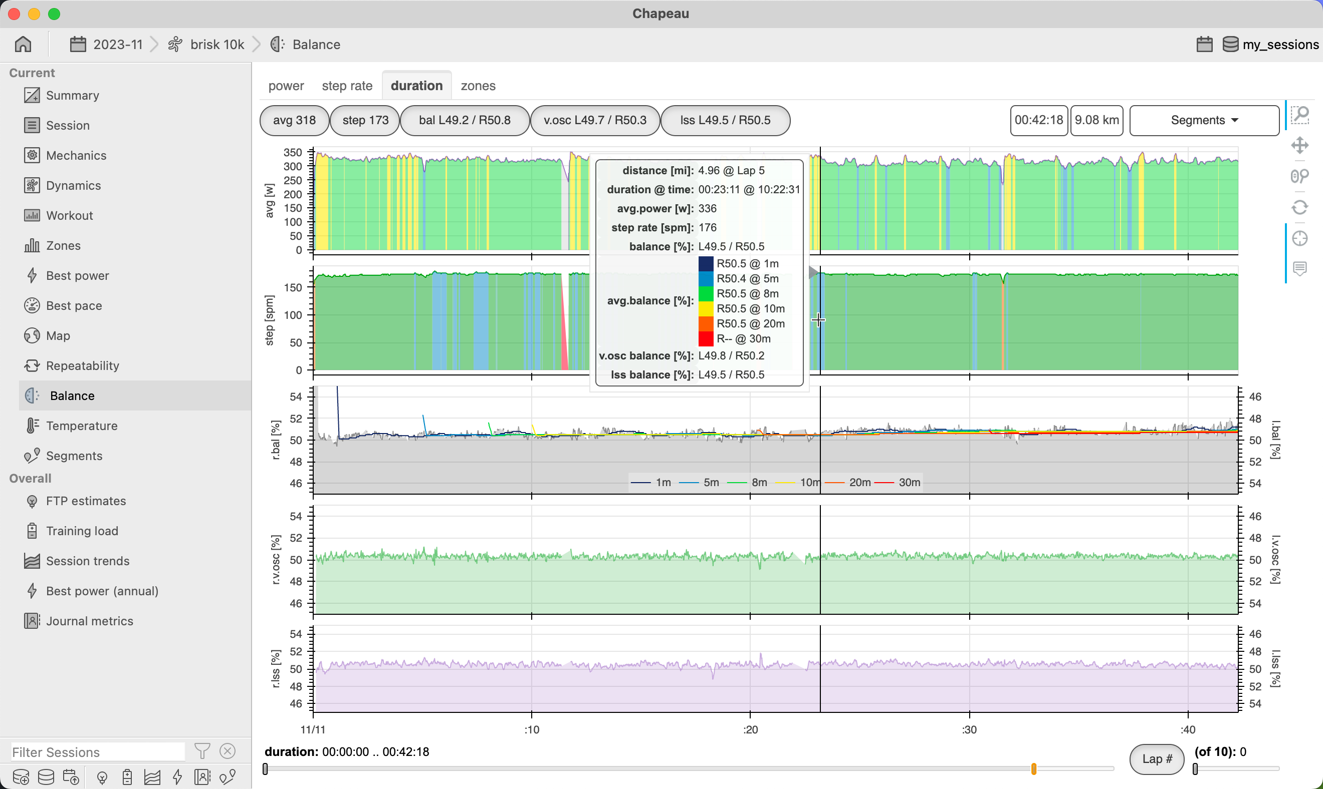
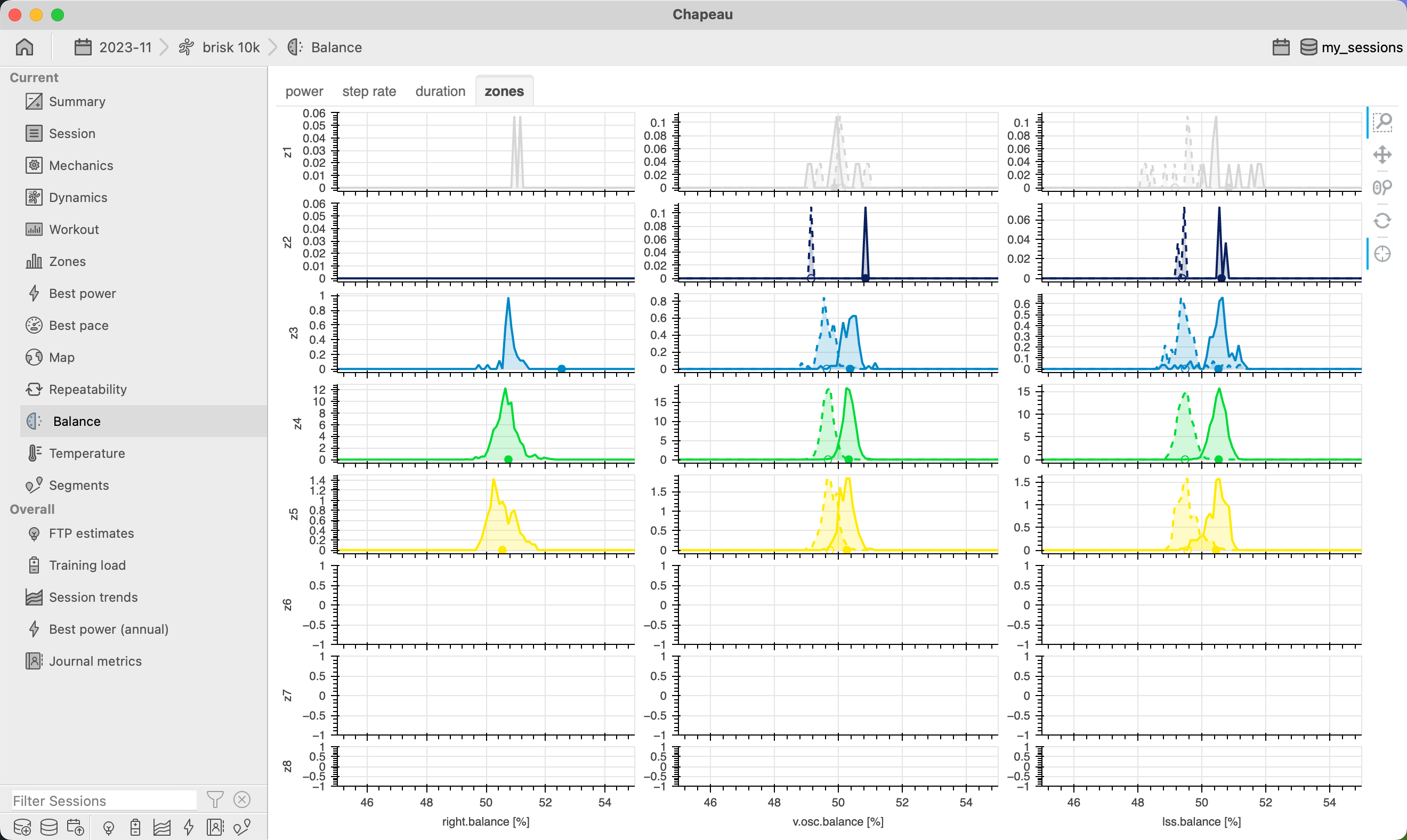
Balance
When available, the balance chart shows a variety of different views against any Balance data that may have been recorded for a session. Charts are available for Power, Cadence, Duration and balance metrics by Power Zone.
Cycling
Power
View Balance and Torque Effectiveness (if available) against average power. Torque Effectiveness represents how much of the power applied to the pedal stroke in a forward direction.
If Left and Right Torque Effectiveness available from the power meter, then two curves and clouds will be depicted (both of which can be toggled on/off by clicking the left right legend items).
Note
Normal range for torque effectiveness is 60-100%, higher numbers are better.
Cadence
Visualize the relationship of Balance and Pedal Smoothness (if available) with respect to cadence. Pedal Smoothness represents how consistently power is delivered to the pedal throughout the full pedal stroke.
If Left and Right Pedal Smoothness available from the power meter, then two curves and clouds will be depicted (both of which can be toggled on/off by clicking the left right legend items).
Note
Normal range for pedal smoothness is 10-40% with higher numbers approaching 30-40% seen as exceptionally good.
Duration
Important
NEW in 2.0 remove outlier data points from balance
NEW in 2.1 included moving averages in hover tool
NEW in 2.1 added L and R percentage indicators on balance chart
Time based view of balance data over the full session. Dynamic based on data available for balance (not all power meters report or record all balance metrics) and will show Left and Right data wherever this is split out by the power meter.
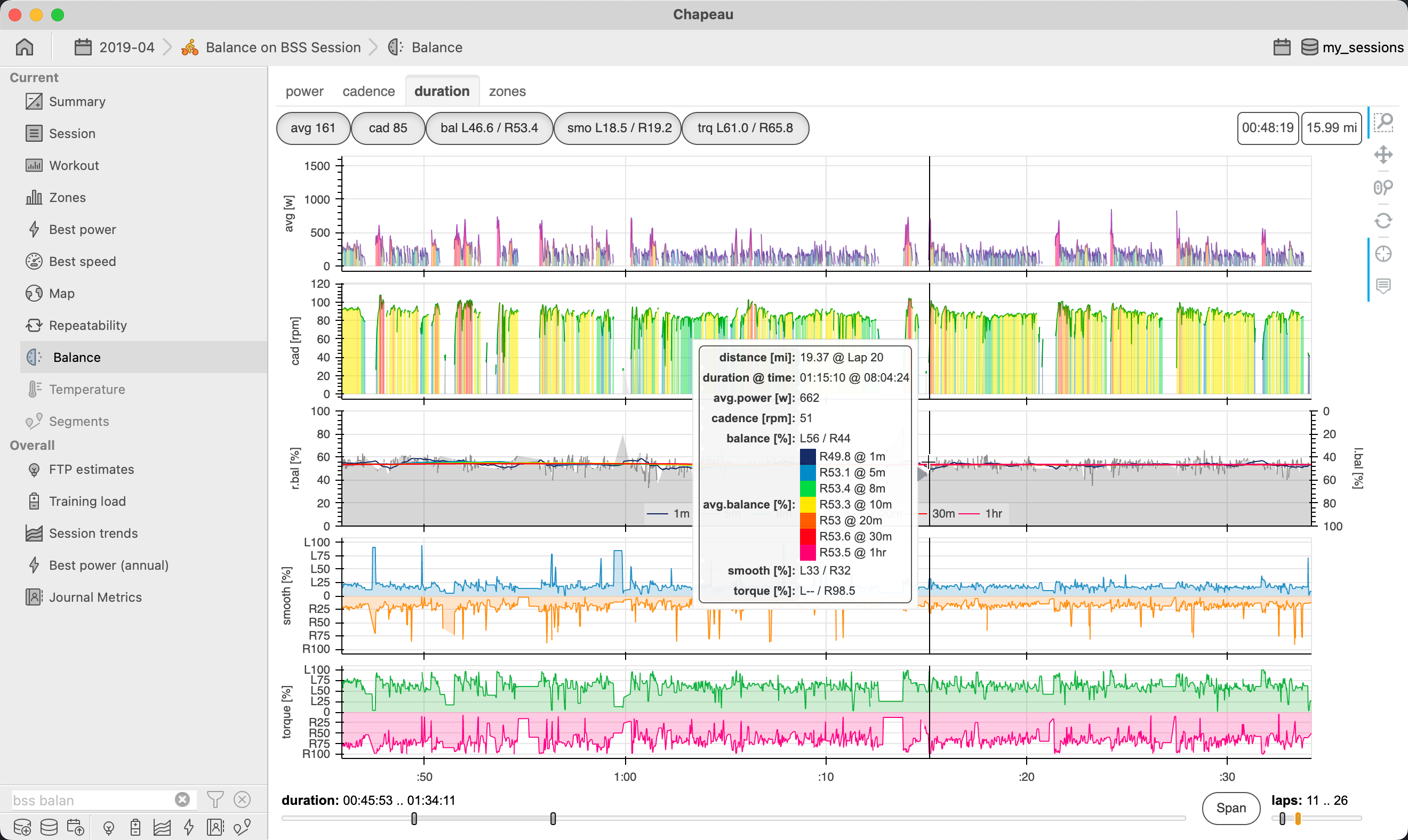
Note
Chapeau uses a moving window approach to remove outliers from balance data, this is based on the observation that many power meters report far more 0’s and 100’s than what would normally be expected.
Zones
Important
NEW in 2.2 added indicators for mean values
For cycling sessions show Balance, Pedal Smoothness, and Torque Effectiveness for each power zone. The purpose of this chart is to show how these metrics change as intensity increases or decreases.
Note
Quite often athletes will focus only on overall averages for balance, pedal smoothness, and torque effectiveness and in many cases these overall averages can be dominated by Z1 volume. This chart enables the athlete to see if their overall averages are reflected across all zones or not.
Running
Important
NEW in 2.6 added support for running sessions
NEW in 2.6.2 added support for Stryd Duo balance metrics
Power
View Balance and Leg Spring Stiffness Balance (if available) against average power.
If Left and Right Leg Spring Stiffness Balance available from the power meter, then two curves and clouds will be depicted (both of which can be toggled on/off by clicking the left right legend items).
Step Rate
Visualize the relationship of Balance and Vertical Oscillation Balance (if available) with respect to step rate.
If Left and Right Vertical Oscillation available from the power meter, then two curves and clouds will be depicted (both of which can be toggled on/off by clicking the left right legend items).
Duration
Time based view of balance data over the full session. Dynamic based on data available for balance (not all power meters report or record all balance metrics) and will show Left and Right data wherever this is split out by the power meter.
Note
Chapeau uses a moving window approach to remove outliers from balance data, this is based on the observation that many power meters report far more 0’s and 100’s than what would normally be expected.
Zones
For running sessions show Balance for each power zone. Vertical Oscillation Balance and Leg Spring Stiffness Balance will also be shown if available for the session. The purpose of this chart is to show how balance metrics change as intensity increases or decreases.
Note
Quite often athletes will focus only on overall averages for balance and in many cases these overall averages can be dominated by Z1 volume. This chart enables the athlete to see if their overall averages are reflected across all zones or not.
Temperature
Important
NEW in 2.3
NEW in 2.3.1 show core temperature zones on the dynamic core temperature plots
NEW in 2.3.1 include the core temperature zone name in hover tool tip
NEW in 2.4 include % heart rate reserve, % 6-minute power, and the ratio of % heart rate reserve to % 6-minute power
NEW in 2.6 added support for running sessions
The Temperature Chart is available for session with temperature and heart rate or power. If core temperature data is available for the session, then it too will be included. Core Temperature can be collected using a CORE Sensor – only present in FIT files.
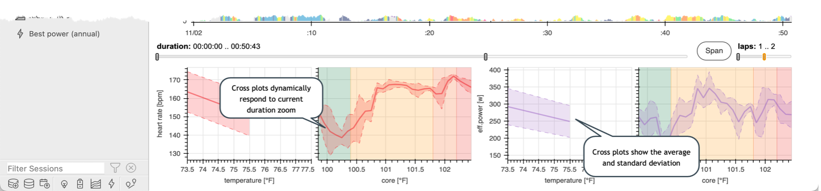
The chart depicts the relationship of heart rate and power with respect to external temperature and (optionally) core temperature. Dynamic plots along the bottom that show relationship of heart rate to temperature and core temperature and effective power to temperature and core temperature.
Factor plot shows heart rate with respect to heart rate reserve, power with respect to 6-minute power and the ratio of these two (using a 20 min moving average). Best for long duration low intensity sessions, the Factor plot highlights cardiac drift (which can be temperature influenced) and the ratio shows relative load throughout the session, higher ratio values indicate more heart rate for same power or less power for same heart rate.
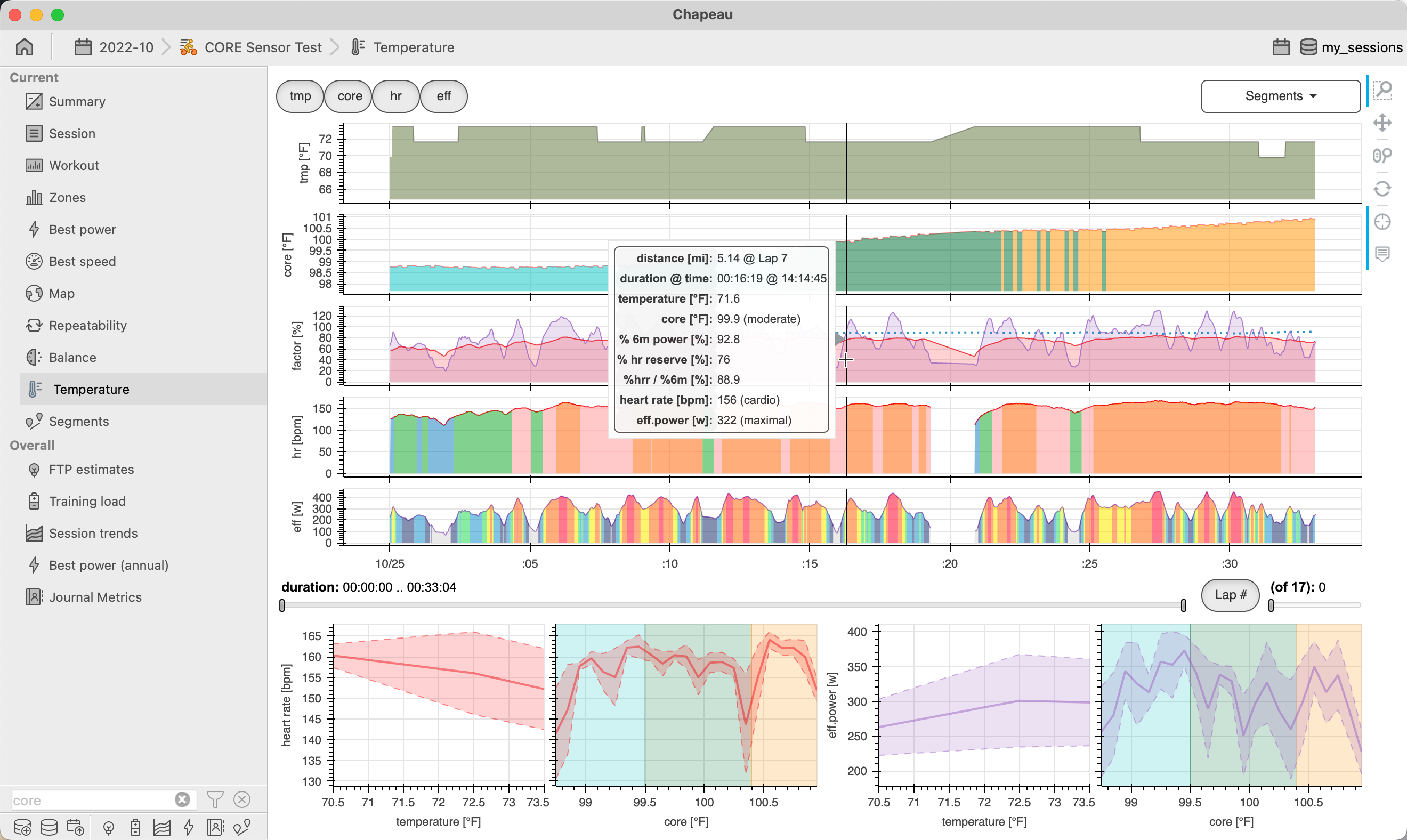
Note
For cycling sessions 6-minute power is used as a proxy for VO2 max power whereas in running sessions 10-minute power is used as a proxy for V02 max power.
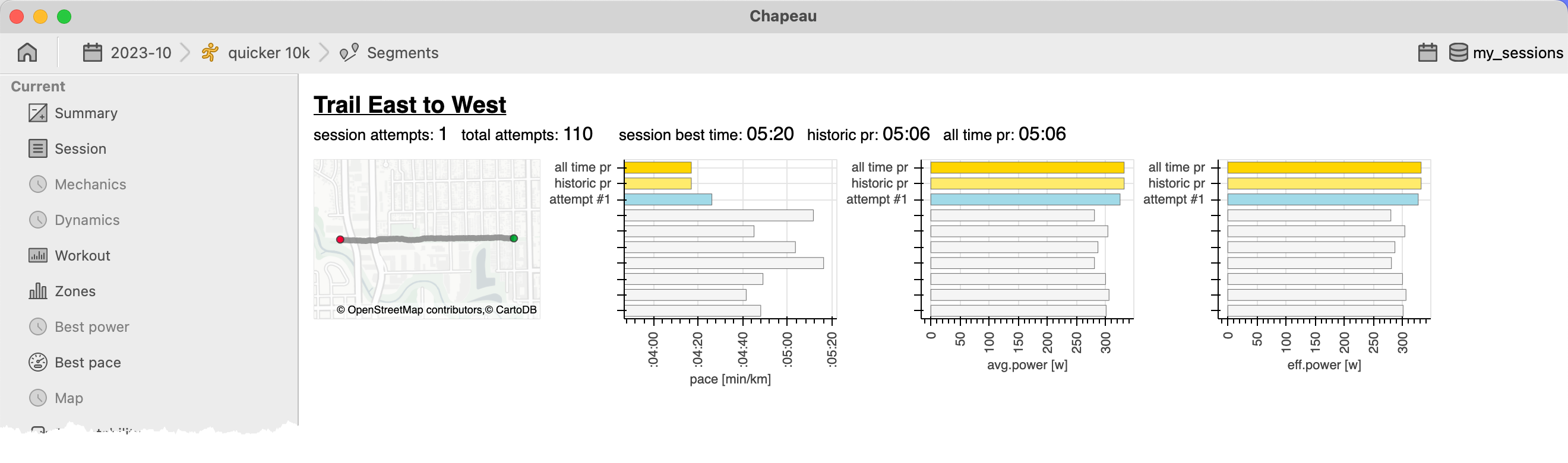
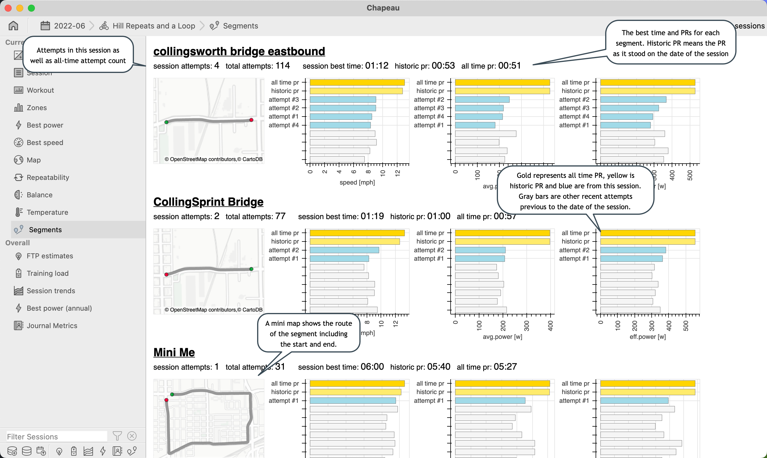
Segments
Important
NEW in 2.6 added support for running sessions
The Segments Chart shows all the segments encountered during the session and lists the All Time PR, Historic PR, and session best times as well as PR’s and bests for other metrics.
Cycling
Running